FAPAM
Community, information and student recruitment in a single digital experience.


From two digital products to a single experience
FAPAM had a student portal and an enrollment landing page, kept separate. The new website had to serve people who already study there and people who are still deciding.
Student portal
Services · activities · links
Enrollment landing page
Recruiting new students
One institutional website
Inform, make services easy to reach and attract new students.
How do you inform, make services easy to reach and, at the same time, attract new students?
Four audiences, two goals
- StudentsServices and quick access
- ParentsPrograms and campus life
- FacultyInformation and resources
- Prospective studentsYoung people choosing a career
Experience: information, belonging and services. Conversion: leads and enrollment.
Organizing a lot of content without losing the user
A benchmark of other institutions: menus, program categories, hierarchy and paths to enrollment. The result became the site's navigation structure, with a main menu for recruitment and a secondary menu for the community.
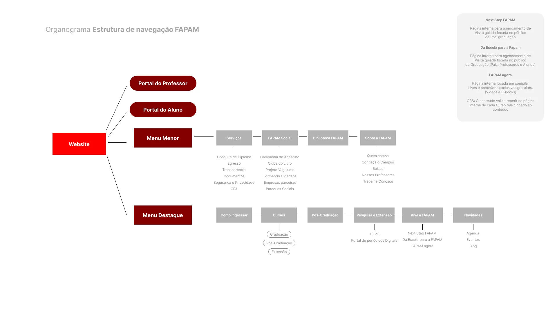
Navigation principle
Information without overload
The answer: strong hierarchy, interface patterns, clear CTAs and fewer decisions per step.
The home page shows what happens inside FAPAM
Instead of only showing what the college offers, the home page opens with the marketing campaign and then brings in the calendar and events: fairs, keynote lectures and community initiatives.
- 01Students. Taking part and a chance to see themselves in the content.
- 02Prospective students. A feel for what it's like to be part of the community.
- 03Parents. A view of everyday life on campus.
- 04Faculty. A showcase for the institution's initiatives.
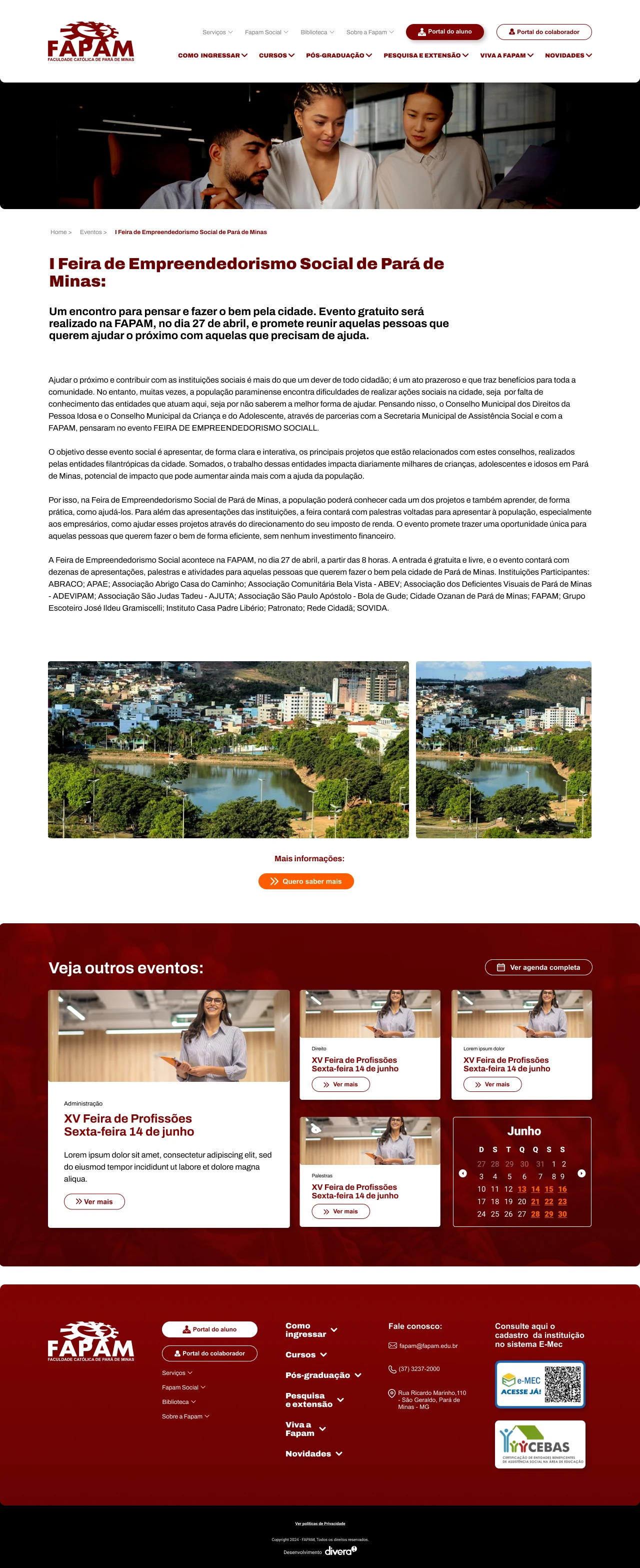
Same system, different feelings
Undergraduate · light theme
Friendly and approachable: an easy transition from high school.
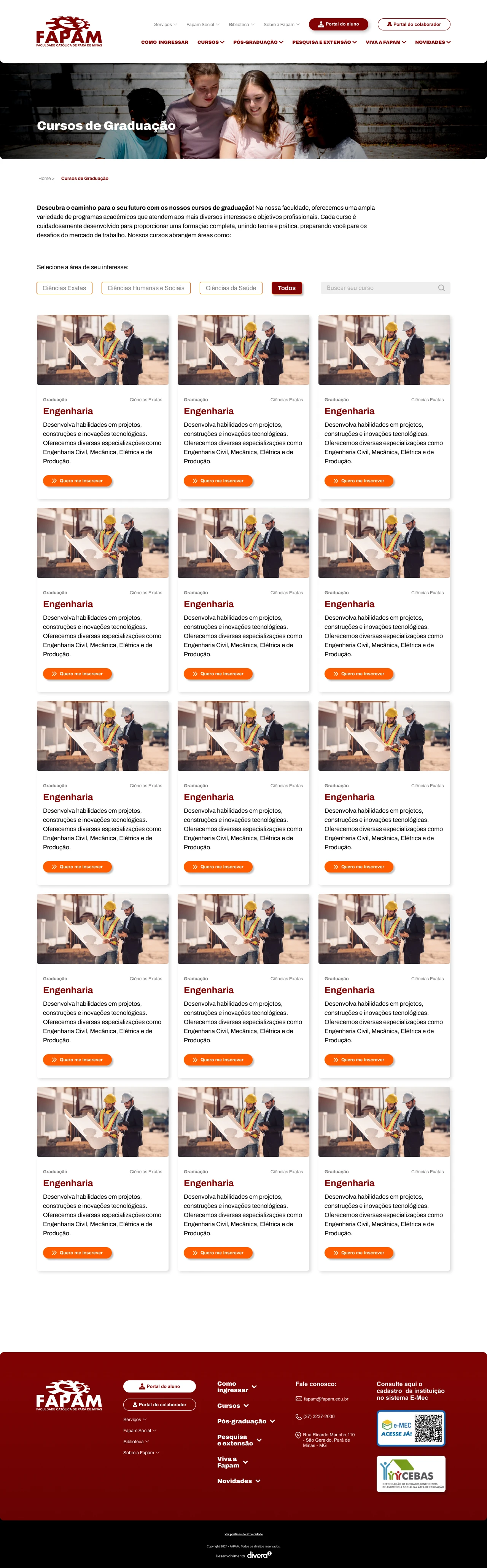
Graduate programs · dark theme
Darker and more high-end, associated with technology and specialization.
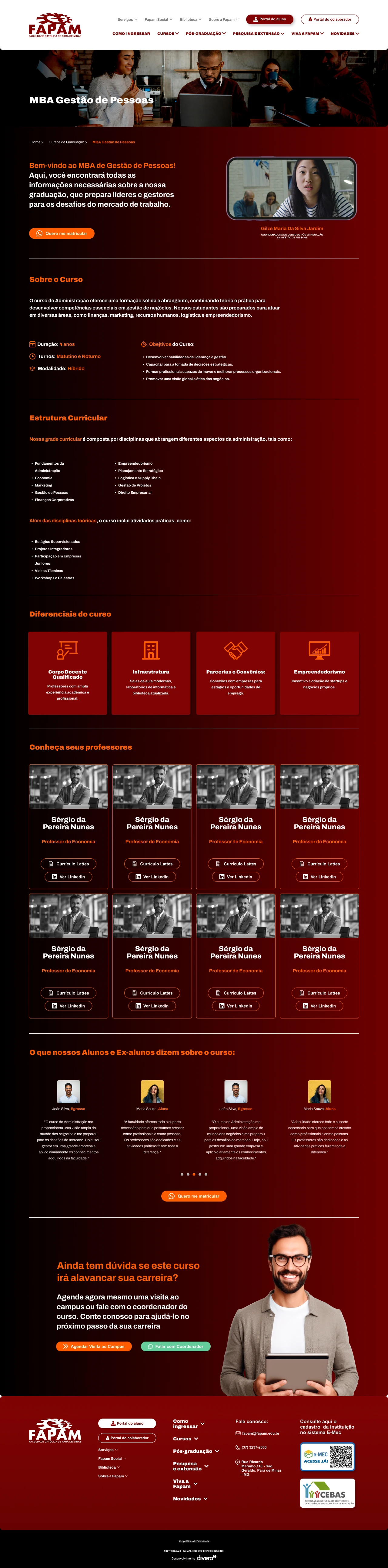
A progressive decision journey
The program page as a “second home page”
Is this where I want to study? The page doesn't just explain the program: it helps prospective students decide, and ends with a clear action.
- 01About the program
- 02Facilities and labs
- 03Faculty
- 04What sets it apart
- 05Alumni testimonials
- 06CTA · Apply now
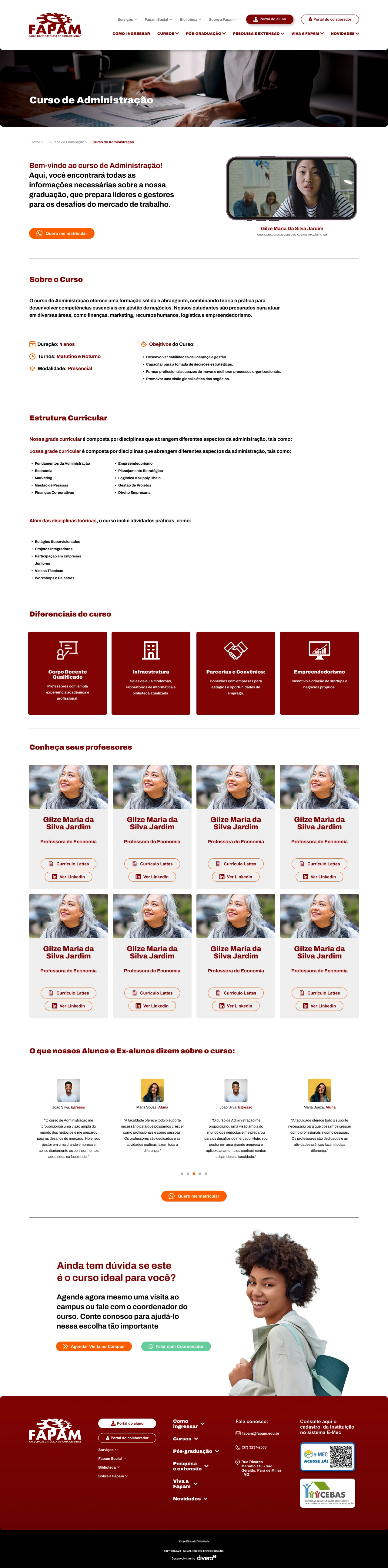
Users don't relearn the interface on every page
Navigation
Adapted to each context, desktop and mobile.
CTAs
Always visible on every page.
Patterns
The same components across the whole site.
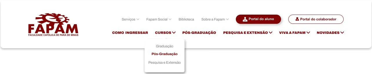
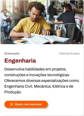
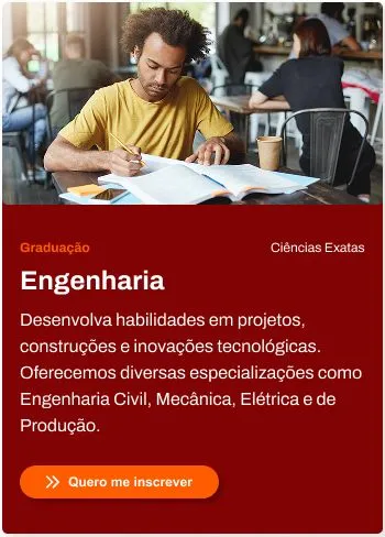
The same brand, lighter in digital
The identity already existed. The work was adapting it for reading lots of content: red only as an accent, and white space to breathe.
The experience became numbers
+40%
more website visits than the previous version.
Enrollment
Significant growth in enrollments coming from organic Google search, with the website as one of the main student recruitment tools.
Video testimonial (in Portuguese): Prof. Reinaldo Galvão, head of graduate programs at FAPAM, talks about how the project began and the new website's impact on the college's results.
A closely followed handoff with the development team to preserve the UX and UI decisions.
What I would do differently
I would adapt the brand even further for digital: less red gradient, a flatter visual language and a softer palette.
What I take with me
Think about the whole product, not isolated pages.